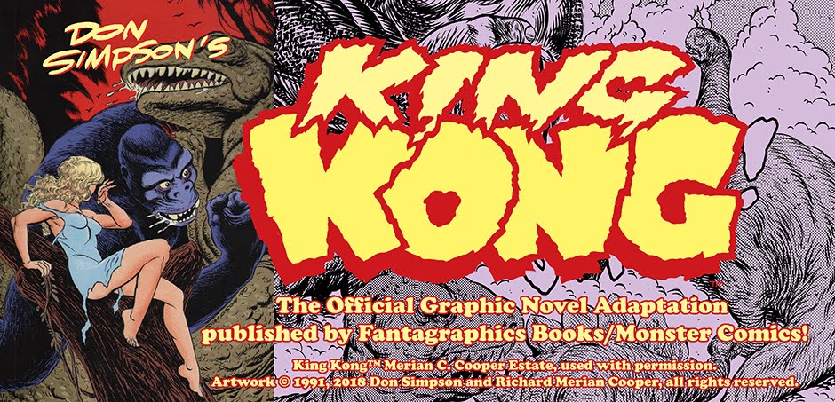
Don Simpson's 1991-1992 official, complete, and authorized graphic novel adaptation of
King Kong contains many wonders for the discerning cartooning fan. Based on the 1932 book by Edgar Wallace, Merian C. Cooper, and Delos W. Lovelace, it includes numerous scenes deleted from the film for sexual or racial content. In addition, the cartoonist, who scripted, penciled, inked, and lettered more than 130 pages for the project, added numerous personal touches, inside jokes, and easter eggs of admiration in his labor of love
 |
| A brontosaurus makes mince meat of the visitors to Skull Island! |
Below are a selection of favorite panels and tiers from
the classic tale. Created in a simple "newspaper style" vocabulary and
originally published in black and white, Simpson's art made ample use of
"black spotting," vigorous brush and pen and ink drawing (including
raking the original art with a razor blade to achieve expressive,
sweeping effects), hand lettering, and simple but effective dot screens
(known in pre-digital days as Ben Day, Zipatone, and numerous other
brand names).
 |
| Carl Denham, defeated by Skull Island, returns from his afternoon in Jurassic Park. |
Harkening back to the classic adventure strips of Noel Sickles (
Scorchy Smith), Roy Crane (
Wash Tubbs), and Leslie Turner (
Cap'n Easy) - as much, if not more, than such obvious influences as Wally Wood, Frank Frazetta, and EC Comics - Simpson successfully evokes the nostalgia of the period without directly quoting from the 1933 RKO Pictures movie
 |
| Kong reaches for Ann Darrow. |
"We only had rights to the book," Simpson notes, "which freed me from a
literal adaptation of screen images and actors' likenesses." Another bonus were added scenes left out of the
film, or cut by exhibitors and TV stations over the years; these included shots of lethal, giant spiders devouring the crew of the ship, and Kong's grisly rampage through a native village.
 |
| The secret map to Skull Island (in 3D)! |
Simpson also took liberties with Ann Darrow, love object and heroine of the piece, emphasizing her physicality and blatant sexuality. "She's a strong heroine," says the cartoonist, "and pretty confident, even while being pursued by a giant ape." The 1991 graphic novel taps into the underlying eroticism implicit in
King Kong, perhaps more than any adaptation of the story before or since.
 |
| Jack Driscoll and Ann Darrow on board the tramp steamer. All men are basically monkeys of one sort or another! |
"But she always retains agency," notes the cartoonist. "In my version of the story, she doesn't end up in the arms of Jack Driscoll; she's alone on the pinnacle of the Empire State Building, along, weeping for her fallen would-be suitor, who in his childlike way never understood the modern world."
 |
| Tied to the altar, Ann awaits her fate! |
Simpson's distinct emphasis of the female figure is contrasted with almost cartoony renditions of the giant ape and other denizens of Skull Island, including the dinosaurs. "I was trying to evoke the artificiality of gorilla costumes and rubber suits, and model kits of dinosaurs, as much as 'real' dinosaurs," says the artist. "This isn't a
Kong where verisimilitude is a high priority; it's a primal story, evoking childhood and immature conceptions of reality. I wasn't trying to hit readers over the head with paleontology, like Stephen R. Bissette's
Tyrant. I was telling a 'rattling good' pulp story in the manner of Edgar Rice Burroughs, by way of Philip José Farmer."
 |
| Gas bombs take down the stegosaurus! |
The original six-issue series featured a variety of covers by noted fantasy illustrators, including Dave Stevens, Mark Shultz, Al Williamson, Ken Steacy, and two by William Stout. "Dave just swiped a movie still of Faye Wray," Simpson recalls, "which technically violated the contract with the Merian C. Cooper estate." Worse still, the cover amounted to the entirety of publicity by the publisher on behalf of the series.
 |
| Kong paws for Jack! |
Don Simpson, best known as the creator of the superhero parody Megaton Man, seemed an unlikely choice to adapt
Kong. "I knew Gary Groth and Kim Thompson, of course, as well as Thom Powers, who was heading up the Monster Comics and Erox Comix imprints," recalls the cartoonist. "Gary always had nice things to say about my black-and-white science fiction saga Border Worlds, and maybe they also saw
Pteranoman #1, which featured dinosaurs and Cowboy Gorilla. Also, as a reliable writer, artist, and letterer - who would work cheap - I was kind of one-stop shopping. But
Kong is not something I would have sought out or begged to draw."
 |
| Seaman Jack Driscoll is no big-game hunter! |
"The marketing of
King Kong was an enormous missed opportunity, in my view," says Simpson. "Fantagraphics [publisher of the industry-antagonist
Comics Journal]
seemed to think that achieving commercial success was as simple as
lowering your standards and deigning to slum in a popular genre. They
never sunk so low as to produce a superhero comic book, but for them,
King Kong
was selling out. Naturally, when a publisher is that ambivalent about a
project, they're not going to be wholehearted in their promotion of
it."
 |
| Ann takes charge of the relationship! |
Simpson recalls attending a San Diego Comicon during the period in which his
Kong was appearing. "The publisher was happily promoting
Love and Rockets,
Eightball, and their other critically-acclaimed arthouse projects," notes the cartoonist. "But
King Kong, they were hiding under a bushel. The only display I saw at the show at all concerning
Kong was
a vintage movie poster at a dealer's table. Here was a household word
and I was busting my balls to write and draw the best adaptation I could
manage, and the publisher was inexplicably taking a dive on the
project. That's what I call a missed opportunity."
 |
| Stripped to her skivvies, Ann remains athletic! |
The six-issue serialization format also proved a mixed blessing. "On
the one hand, I had ample room to explore the story graphically, using
silent panels, tall panels, wide-screen panels, and so on," says
Simpson. "I could essentially indulge my impulses to direct my own movie
version. On the downside, however, it meant trying to hold an
audience's attention for over a year, as six bi-monthly issues rolled
out. And everyone already knew the ending of the story, so it wasn't as
if I had suspense working in my favor."
 |
| The only escape from the cliff is a death-defying drop into the lake ... |
Don Simpson's adaptation of
King Kong preceded the
age of the graphic novel by several years. "At that time, in the early
1990s, single-issues were still what comics readers expected. The idea
of packaging or repackaging a story into a trade paperback was not yet a
'thing' that was widely accepted, or done very often, believe it of
not. A decade later, 'graphic novels' became the norm - fans wanted
longer, self-contained reads. Fantagraphics could have taken the lead
there - I even numbered the pages 1 through 135, so I always conceived
of it as a single graphic novel. But they neglected that golden
opportunity as well.
 |
| Jack brings Ann back from her harrowing adventure on Skull Island! |
Fans have been mystified that the series has not been collected in the
quarter-century since its only printing, and the artist suspects
collusion. "I have reason to believe - because insiders have told me -
that a consortium of licensors, Hollywood producers, and comic book
publishers have conspired to keep my 1991 King Kong out of print,
because they didn't want competition or comparisons. I particularly
believe this is true in the case of Dark Horse Comics, who put out an
execrable adaptation of the 2005 Peter Jackson film. I believe someone
there has it in for me, because they also sicked Charles Atlas, with
whom they were creating some merchandise, on me for a parody
advertisement I did around the same time."
 |
| Ann has just about enough of Carl Denham's ruthless exploitation ... |
Whatever the explanation, why anyone associated with the
King Kong
brand would want to suppress a venerable graphic novel adaptation of
the story - anymore than one would want to suppress the 1977 Dino Di
Laurentis film, or for that matter the original 1993 Edgar Wallace and
Merian C. Cooper Film - is a mystery to millions of fans of
Kong.
"This is an American institution," notes the cartoonist. "The fact that
the story has been told and retold to generations of fans down through
the decades should be a point of pride, not of embarrassment or
censorship."
 |
| The photographers' flashbulbs confuse and anger Kong. |
While the cartoonist singles out a jealous rival publisher, other stakeholders in the
King Kong brand seem just as, if not more, culpable. "You can tell the difference between a brand or a franchise that is strong, like
James Bond or
Batman or
Star Trek,
and can proudly embrace all of its myriad interpretations by various
creators over the years -- from the dark and brooding to the campy and
corny -- and franchises that are timid and weak, and afraid of its own
shadow," notes Simpson. "It is a paradox that
King Kong - perhaps the most macho American entertainment franchise imaginable - is run by such tepid, timid, ahistorical wimps."
 |
| Kong has Ann once again! Only this time, he's taking things downtown ... |
The cartoonist still holds out hope that his 1991 graphic novel will be
collected and released as a true graphic novel. "In 2017, two of my past
projects were gathered into 'squarebound' format," notes the artist. "
Splitting Image, a two-issue series, was re-released along with the
normalman vs. Megaton Man Special, under Jim Valentino's Shadowhawk imprint at Image Comics, as an '
80-page Giant.' At the same time,
Dover Publications gathered together my
Border Worlds science
fiction series series, and did a beautiful hardcover edition. Both of
these are also available on Comixology. I still have all the original
artwork for
Kong; a single-volume edition would be a no-brainer."
 |
| Biplanes approach the Empire State Building! |
While Simpson steadfastly claims
King Kong was never a dream project, it grew into a labor of love over the course of the year-long assignment. "I gave the publisher, and I hope the readers, their money's worth," says the artist. "It was obvious to me early on that Fantagraphics didn't know how to promote a comic book to fans, even when it was already a household word. But I wasn't drawing for the publisher; I was drawing for the readers, and fans of Kong of all ages. And in some abstract way, I was trying to put forward a notion of traditional, all-American cartooning - complete with drooling apes, nearly naked women, and big Zip-A-Tone dot screens - that I thought was beginning to become lost in the 1990s. Boy, did that prediction come true."
 |
| Kong cannot hold on as Ann helpless watches him plummet to his fate. |
While Simpson's "newspaper style" comic strip version of
King Kong languishes in back-issue bins in comic shops all over the English-speaking world, there is still a strong following for the work. "Fans come up to me all the time with issued of
King Kong to autograph, and they want sketches and so. Every convention, every personal appearance - and increasingly on social media - fans demand to see it in bookshelf format. It remains a golden opportunity, if the bean-counters could only unclench their sphincters."
 |
| "'Twas beauty killed the beast!" |
__________________________________________________________
Published by Monster Comics (an imprint of Fantagraphics Books) in 1991, Don Simpson's graphic novel adaptation of King Kong
was first full, complete, official and authorized adaptation of the
1932 story by Edgar Wallace, Merian C. Cooper, and Delos W. Lovelace. It
was in no way related to or derived from any of the motion picture
versions of the story.
The artwork excerpted here is © 1991, 2018 Don Simpson and Richard Merian Cooper, all rights reserved.
See also: The Kong Process from Sketch to Finished Art!
See also: King Kong's Uncensored Scenes Featuring Incredible Shrinking Underwear!