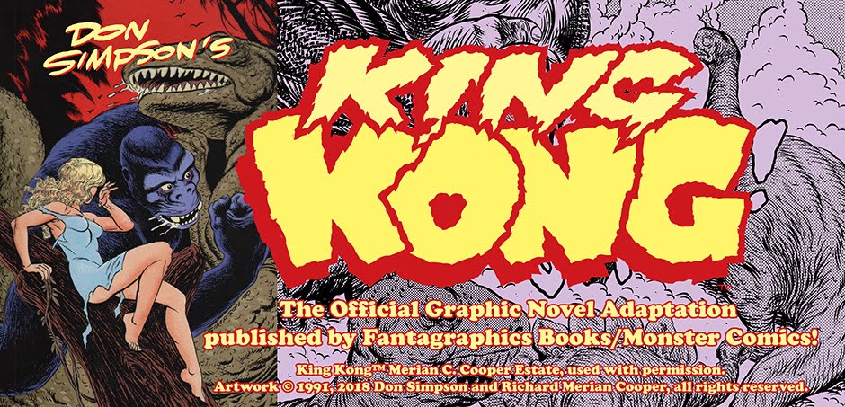
The first issue of
King Kong began an exceptional assignment in my freelance career in many ways (I have always thought of it as freelance work, despite owning co-copyright on the artwork). First of all, it was an adaptation of a well-known story (one could hardly think of a story more familiar to fans of fantasy, sci-fi, horror, comics, or even cinema in general), and an assignment I would never have applied for. Fantagraphics, in fact, came to me - Thom Powers, whom I knew from Detroit, did a lot of the traffic editing for the Monster Comics line. It was in some ways a stretch, requiring period research (not easily accomplished in pre-internet days), and I also had to avoid quoting the movie directly - Fantagraphics only had the rights to illustrate the 1932 story, which was essentially a novelization of the screenplay.


Consequently, I approached the project, and
especially the first issue, with more than the usual preparation. I
recently came across the original 8½" x 11" roughs I made, in rollerball
pen, and was shocked that the finished lettering already appeared on
the roughs. Now, it was not at all unusual for me to start by making
8½" x 11" roughs (I did it for numerous projects at the time, including
Megaton Meets the Uncategorizable X+Thems #1, various
TMNT projects,
Marvel and DC samples, and so forth (I've posted many of these all over
my various blogs). But what is different about
Kong is that I
seem to have actually already lettered the dialogue on the 11" x 17"
Bristol board, made reduced photocopies, then drew the roughs on these
blank pages.
If I typed out a plot or script of some sort,
it's present location is unknown; also, if I scribbled anything at all
in a sketchbook, that is also not on hand; I can only conclude from
looking at these roughs that I panicked to some degree, after lettering
the text on the boards, and wanted to play it safe by roughing out the
visuals, which I then blew up on a photocopier and traced onto the
Bristol with the lettering, then inking.
It may also be the
case that I went to such lengths because I wanted to get the lettering
out of the way first. Lettering of course takes up visual space, and
there's no sense drawing lush jungle backgrounds or cityscapes if they
are only going to be covered over later by lettering. I have since
placed the lettering first, although nowadays I just pencil the
lettering very tightly on my layout, rather than ink the lettering and
make photocopies, as I seem to have done with
Kong.
In any case, this lettering-first extreme was highly unusual for me, and
I don't think I ever went to this length again. In fact, after the
first issue of
Kong, I drew rough layouts without lettering, which was more my usual routine during this period in my career. (Issues #2-6 of
Kong were done in this fashion, and a few examples of those roughs follow at the end here.)
In fact, as I post the, I realize that I only lettered the first twenty
or so pages; after that point, I used my traditional 8½" x 11" rough
template to scribble out my visuals, with only blobs to indicate word
balloons.
I have scanned the roughs here in color, so you can see not only the yellowing as the paper has aged, but also the Avery-label patches over certain panels as I made corrections to the roughs before proceeding to later stages in the artwork.
 |
| These sheet of sketches, on a cream-colored legal pad, predates the first issue - it was for a tryout page that eventually appeared, with some modifications, later in the story (issue #3, as indicated), with Ann stranded up in a tree as Jack tries to rescue her, and Kong is about to go at it with the Tyrannosaurus Rex. |
 |
| Full-size intermediate rough in marker; you can see clearly Ann has on a safari shirt different than what is depicted in the final story. |
 |
| Here is the original inked page, submitted as a sample to Fantagraphics, left, and the page as it appeared in the final story, modified to be more consistent with the surrounding sequence. |
 |
| This is an example of one of the later story page roughs, done full-size (11" x 17") on Strathmore Graphics paper or equivalent, known as a "tissue" for being thin and traceable on a light table. |